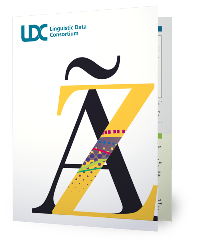
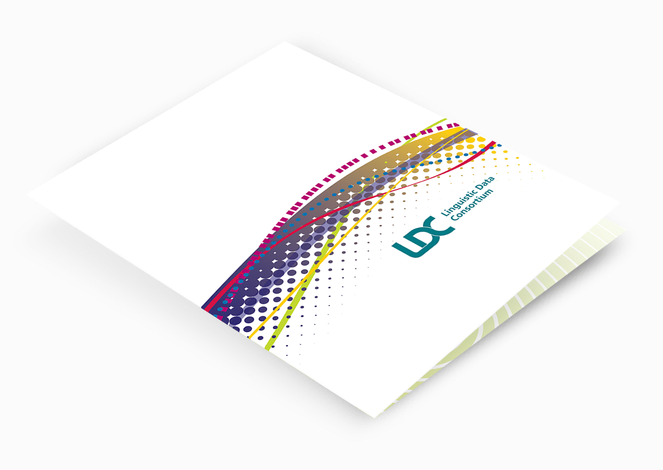
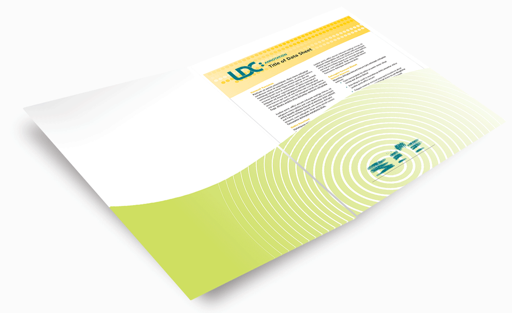
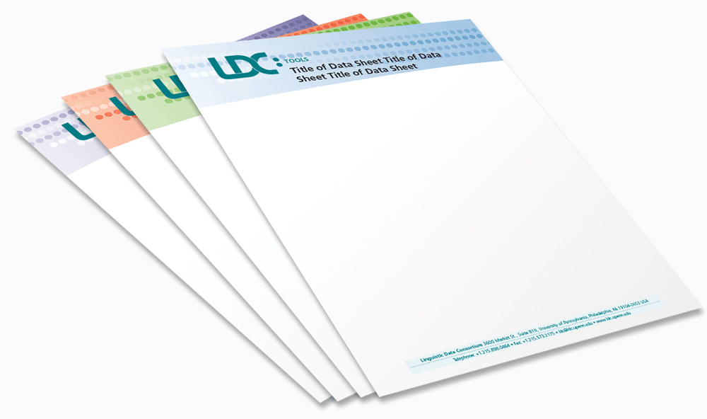
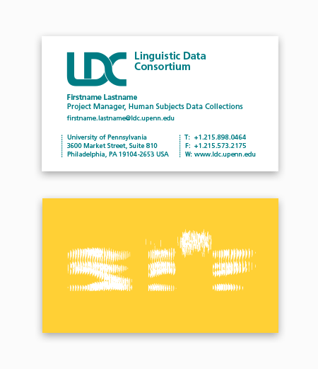
LDC develops specialized data to support language education and research. Since the group does work in so many specialized areas, the identity system was built around a new visual alphabet, a system of colors and shapes that are applied in various combinations throughout all of the materials. M&P began by reimagining the decades-old logo, which included a visual representation of the sound made by saying the letters “LDC” as seen in a spectrogram. The cover of a pocket folder is the Rosetta Stone of the system and uses all of the colors and shapes that are employed in the system. Inside the folder, removing the business card reveals an updated spectrogram visual, a clever surprise that reflects the fact that language, like great design, is often astonishing.


