


The Carnegie Foundation skillfully hits the sweet spot between legacy and the future: With its century-plus of expertise (it was founded in 1905), it tackles longstanding inequities in educational outcomes by using the latest research and improvement science to support K–12 leaders.
In 2021 the Carnegie Foundation introduced new leadership, who brought fresh energy and direction to the organization, emphasizing equity and postsecondary attainment.
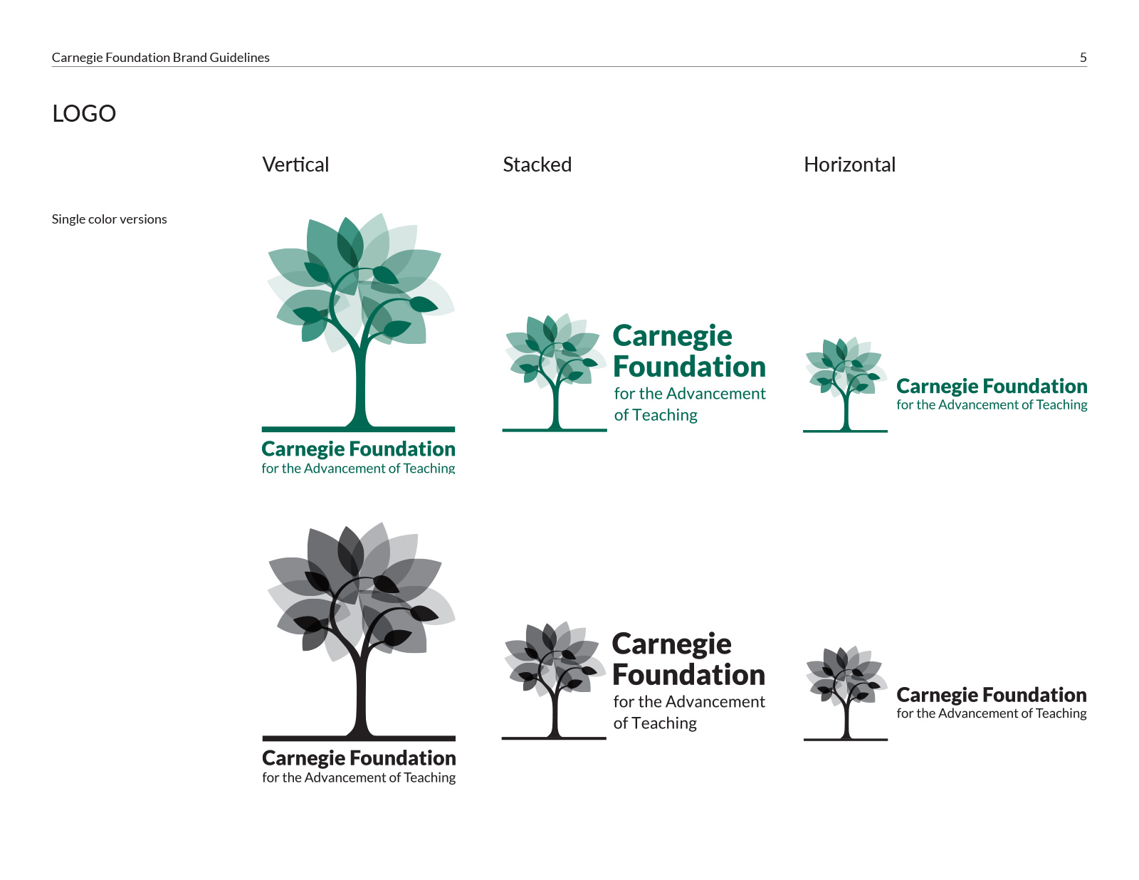
When the Foundation wanted a new look to match its refreshed team and mission, M&P began by reimagining the existing logo: a stylized tree that included a trunk that formed “C” and “F” letterforms. The result was a colorful (some say breathtaking) new mark that was familiar to its audience, with a respectful nod to the Foundation’s history. This striking new, colorful design signaled a bold change to match the organization’s forward-thinking approach.
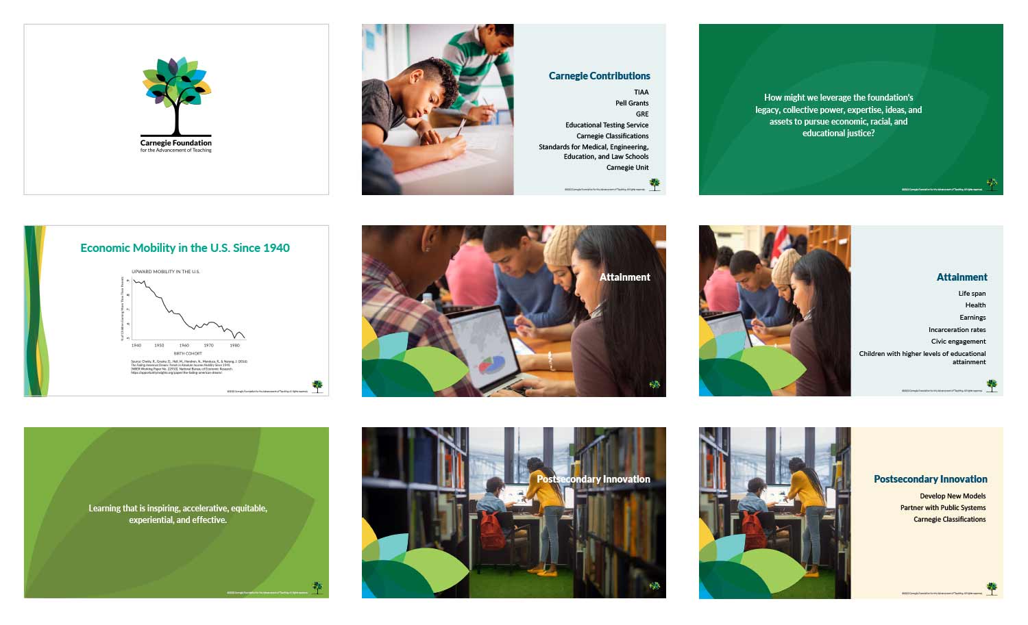
Behind the scenes, we produced a comprehensive graphic standards guide with typographic styles and color palettes so the Carnegie Foundation can create consistent materials for screen presentations, social media graphics, and print and digital publications.